Every business goes through changes and while we often think of our car brands as being a symbol of the car we drive or even a show of wealth, vehicle manufacturers are still a kind of business – and often established ones at that! Some manufacturers are even over 100 years old! With age comes time and with time comes changes and vehicle manufacturers worldwide have taken the constantly changing landscape in their stride. New models, new technologies and even new generations of new customers have passed through their doors and behind the wheels of their cars, so it’s only natural that a surprising number of manufacturers have gone through some drastic rebrands over the years. A new logo can give a business a whole new, up-to-date look and these manufacturers have definitely taken the leap:
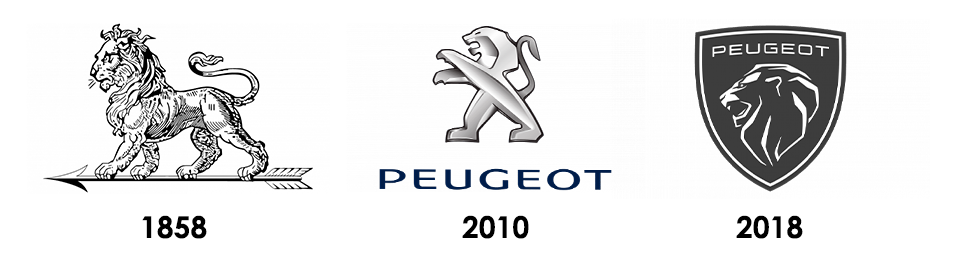
Peugeot
Peugeot’s logo has always had one key element in every new version they’ve released – the lion, no matter the stylisation they choose. The lion was chosen for Peugeot for three main reasons, including its feature in the coat of arms of Valentigney where the steel plant first appeared, its symbolisation of strength and power, and as a testament to the speed, flexibility and stability of their vehicles. Peugeot’s logo has undergone 19 big changes since it was first founded, moving from a classic lion sketch, to the modern metallic look in 2010, all the way through to the digital-ready emblem in 2018.
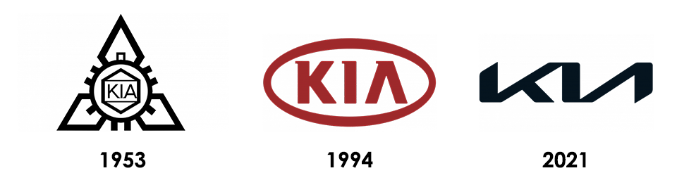
Kia
Despite having been around since the 50s, Kia hasn’t always been a vehicle manufacturer. In fact, the company was originally known as ‘Kyungsung Precision Industry’ and produced bicycle parts. In 1953, they changed to Kia Industries, adopting their first Kia logo, though they didn’t stop producing bicycle parts until four years later when they began producing Honda motorcycles. Kia went through numerous changes within the company itself, including introducing vehicles to their own lineup and in 1994, they adopted the first recognisable logo similar to the one they’ve used recently. In 2021, they dropped the oval and changed up the font to compete digitally and internationally.
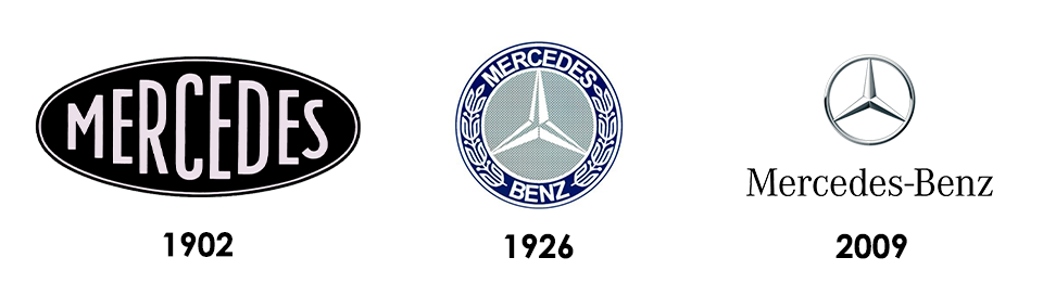
Mercedes
From its quintessentially vintage first logo to the modern classic we know today, Mercedes has gone through numerous changes over the years but has never lost its class. Each logo has taken elements from the one before, working through the changes methodically. From the first simple oval logo, to the first show of the three-pointed star following the Mercedes and Benz merger, through to dropping the laurels and putting the emphasis on the simple three-point symbol we know today, the changes have been numerous, but following a clear and classic pattern.
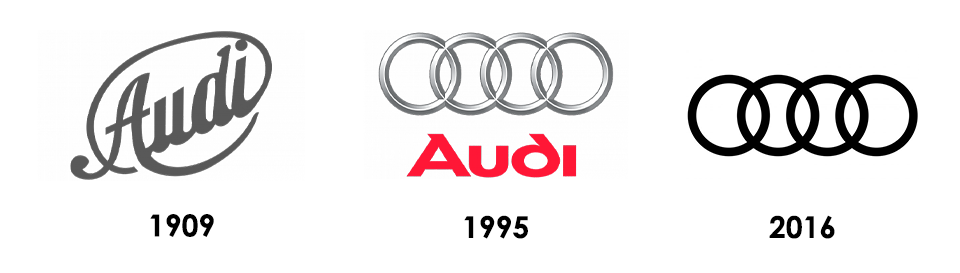
Audi
Pre-launch, Audi’s logo was relatively simple – the brand’s name in a simple oval created by the word itself. However, they quickly moved onto something more recognisable. In 1932, the logo changed to the rings we know today after the economic crisis meant that Audi, Horch, Wanderer and DKW needed to merge in order to stay afloat. They became known as the Auto Union AG and the new logo featured four rings, with each of the individual logos in each ring. It wasn’t until 1995 and a few simple changes that Audi adopted the empty, silver rings we know today. They combined previous logo ideas to create a three-dimensional alternative that stood out in the luxury market. In 2016, the logo was simplified for the online world.
These four manufacturers certainly aren’t the only ones that have gone through some impressive changes over the years. From drastic changes in shape and style, to subtle but numerous adjustments that have led to the modern versions we’re used to today, logo changes can often be a great show of just how far a manufacturer has come.